The Sleeping Beauty font is a decorative display typeface with a storybook feel: flowing, ornamental letterforms suited to headings, invitations and short display text. It is a real font family — listings show regular, italic, inverse and light styles — but it is not the lettering from Disney’s 1959 film, which used its own hand lettering and production artwork. This guide explains what the font is, where it works, where it fails, and what to check before using it commercially.
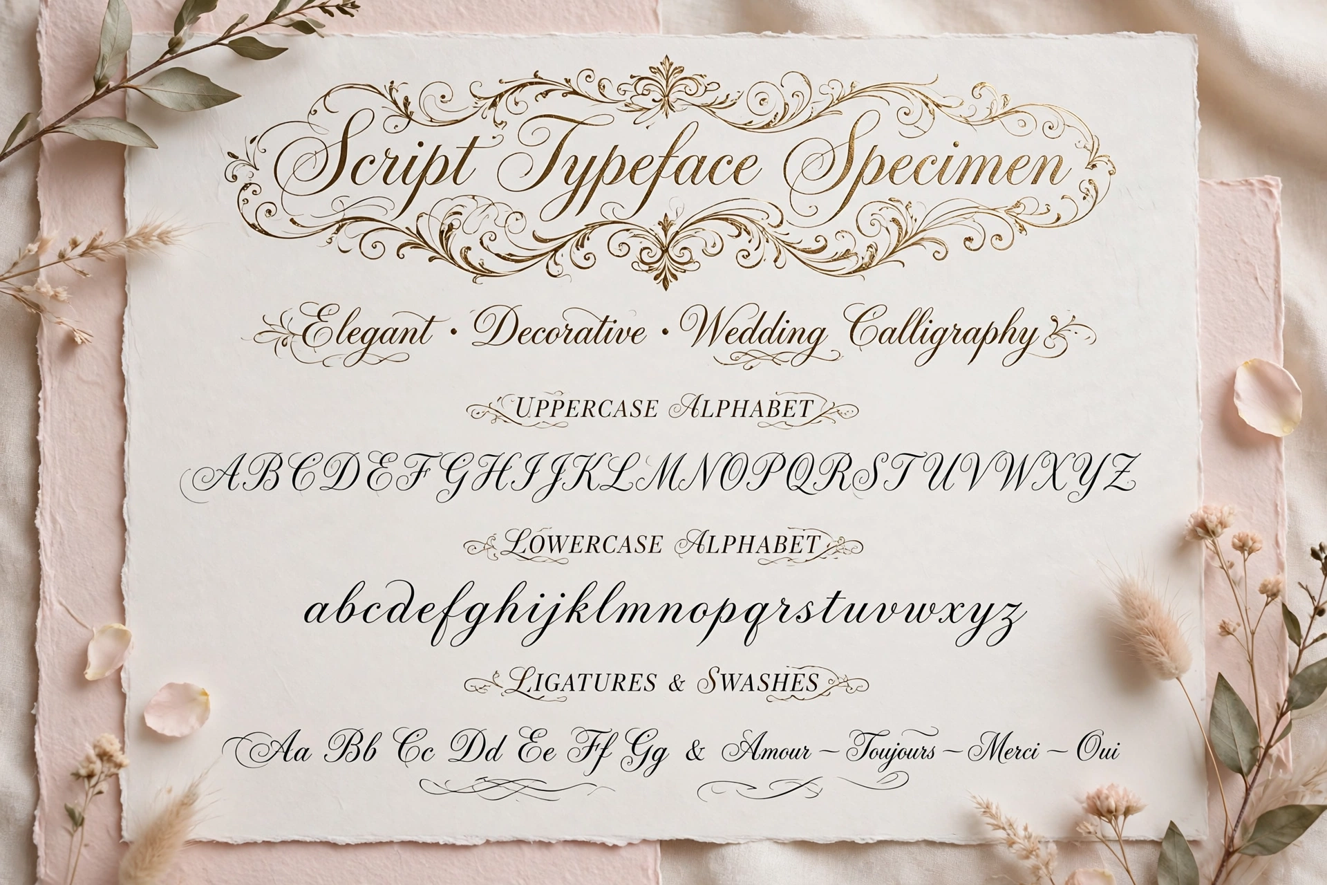
What the Sleeping Beauty Font Actually Is
Font listings describe Sleeping Beauty as a decorative typeface family with four styles: regular, italic, inverse and light, covering basic Latin characters. The listing on CDNFonts marks it as free for personal use, with the designer credited via dafont. That single detail matters more than any marketing description: before using it on a product, a logo or client work, check the licence on the source you download it from, because “free for personal use” does not automatically mean free for commercial use.
Where It Works Best
Use Sleeping Beauty for short display text where its ornament is the point: wedding invitation headings, greeting cards, book-style headings, boutique packaging headers and social graphics with only a few words. At large sizes its curves and flourishes read as elegant and romantic. Pair it with generous spacing and a plain background so the letterforms have room to breathe.
Where It Does Not Work
Do not set body text, long paragraphs, menus or small captions in this font. Ornate display faces lose legibility quickly at small sizes and in long passages, and readers will strain or skip the text entirely. The same applies to call-to-action buttons and navigation: if the reader has to work to decode the words, the design has failed, however pretty it looks. Test every use at the actual size it will appear, on a phone screen as well as on paper.
Pairing It With Other Fonts
The standard, reliable approach is contrast: Sleeping Beauty for the heading, a clean sans-serif for everything else. Common neutral body choices include Helvetica, Lato and Open Sans — any plain, highly legible sans will do the job, and the choice matters less than keeping body text simple. Keep to two typefaces in a project, use one or two weights of the body font, and let size and spacing — not extra fonts — create the hierarchy.
Colour, Contrast and Readability
Soft pastels and deep jewel tones suit the fairy-tale mood, but mood must not beat readability. Dark lettering on a light background, or light lettering on a genuinely dark background, with strong contrast, is the safe rule. Avoid placing ornate lettering over busy photographs or patterned backgrounds, and avoid low-contrast combinations such as pale gold on white, however elegant they look in a mock-up. If you are designing invitations, print a test copy: screens flatter thin strokes that disappear on paper.
Licensing: The One Check You Must Not Skip
Because listings mark this family as free for personal use, a commercial project — a product for sale, a client’s branding, paid advertising — needs a licence check first. Download only from a source that states its licence clearly, keep a copy of that licence with the project files, and if the licence is unclear, choose a different typeface rather than assuming permission. Using an unlicensed font on commercial work can lead to a takedown or a licensing claim, which is an avoidable risk for a decorative choice.
Alternatives in the Same Storybook Style
If Sleeping Beauty does not fit your licence needs or your design, look in font libraries under storybook, fairytale, calligraphic and decorative script categories, and test candidates at heading size and at small size before committing. Judge a replacement on the same criteria: legible at display size, clean at a glance, and licensed for your actual use. A slightly plainer script that you can legally use beats a prettier one you cannot.
FAQs
Is the Sleeping Beauty font the Disney font? No. Disney’s Sleeping Beauty artwork used its own production lettering and hand-drawn titles. This is a separate decorative font family that shares the name and the storybook mood.
Can I use it for my business logo? Only if the licence from your download source permits commercial use. Listings describe it as free for personal use, so verify before commercial use.
Can I use it for body text? You can, but you should not. It is designed as a display face; long text set in it is hard to read and looks unprofessional.
Final Thoughts
Treat the Sleeping Beauty font as what it is: a charming display face for short, large, romantic headings — wedding invitations above all — paired with a plain body font and used only under a licence that covers your project. Used that way, it adds exactly the elegance and whimsy its name promises. For related design reading, see our guides to 1940s wedding dress styles and Magnolia Home Fashions fabric ideas for the same vintage-romantic mood in fashion and home decor.